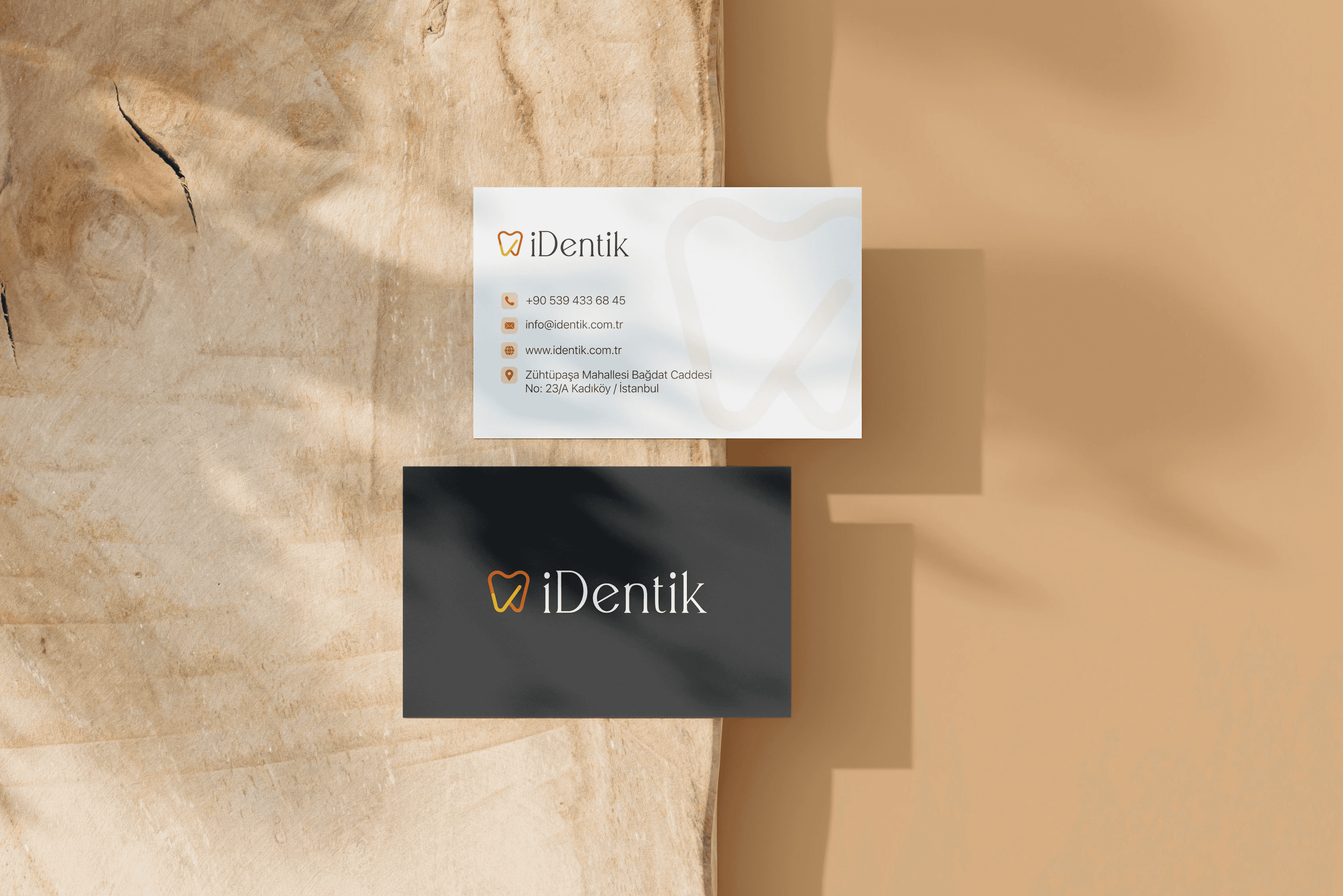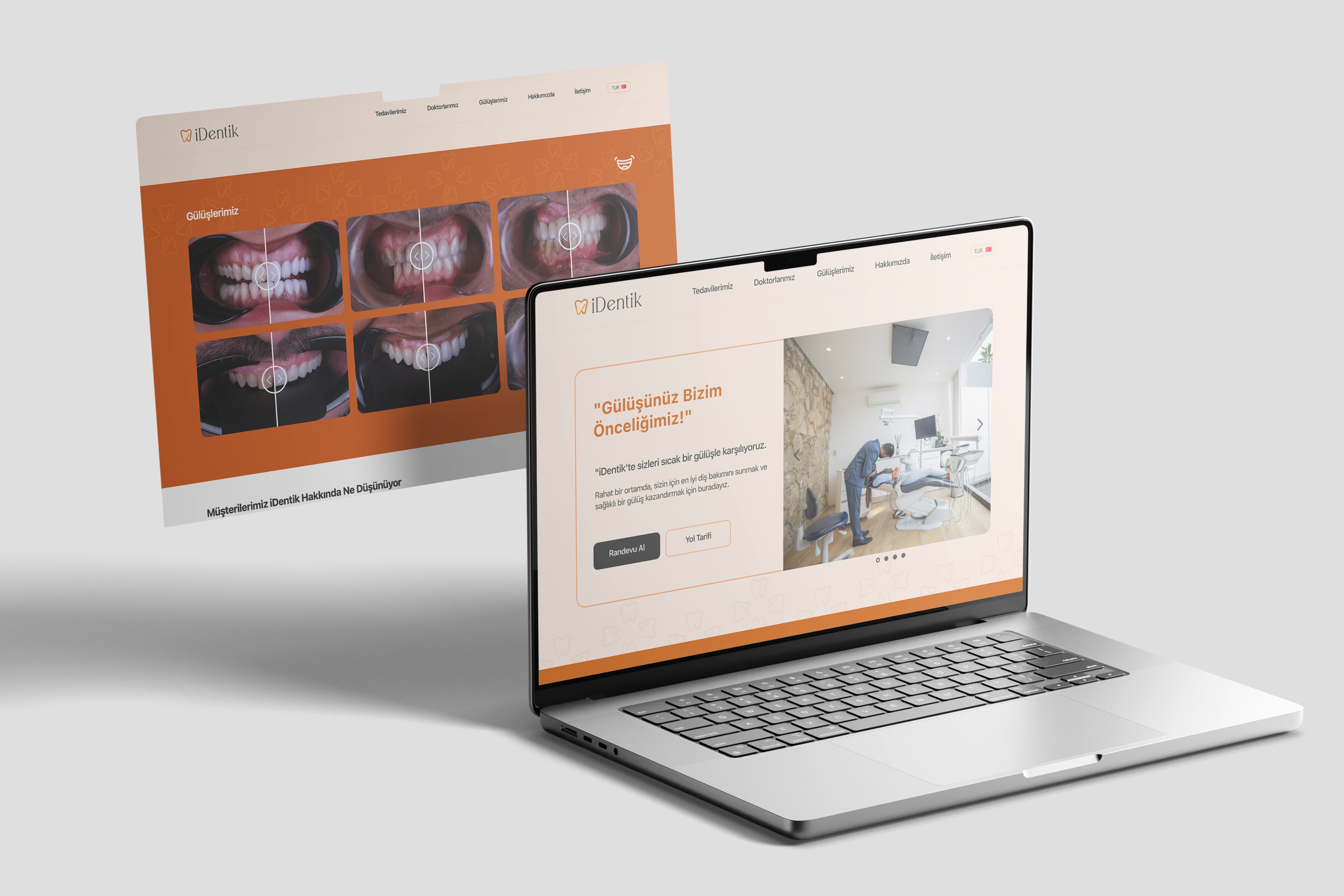

The logomark features a stylized tooth, intersected by a diagonal line forming a subtle check mark—symbolizing reliability and reinforcing the idea of being the “right address” for dental care.
A warm palette of orange tones was chosen to move beyond traditional color schemes, adding energy and approachability. The logotype complements this warmth with an elegant typeface, avoiding generic industry styles to reflect a more sophisticated and professional image.